Table of contents
- Public transport planning workflow: Start with access
- Map the flows
- Check crowding
- Find the problem trips
- Fix the transfers
- Make it operable
- Make runtimes real
- Public transport planning workflow: Add money early
- Ground it in observed data
- Design options, then compare
- Check emissions and side effects
- Stress-test the scenario
- Scale the workflow
- A simple checklist
A public transport planning workflow rarely fails because we lack ideas. It fails because evidence is scattered across tools and teams. Accessibility is analyzed in one place, passenger demand in another, operations in a spreadsheet. Costs and impacts often arrive too late to shape decisions.
In this article, I share the workflow I use in PTV Visum to connect those pieces. The goal is not “more analysis”, but rather faster, more defensible decisions that stand up across planning, operations, and finance.
This workflow is designed for:
- Public transport authorities building the evidence base for service changes
- Operators who need operational checks before implementation
- Consultants who must explain trade-offs clearly to multiple stakeholders
In short, the workflow is this: start with where people can reach, confirm where they travel, translate that into loads and reliability, check vehicles and costs, then test scenarios and side effects before you commit.
Public transport planning workflow: Start with access
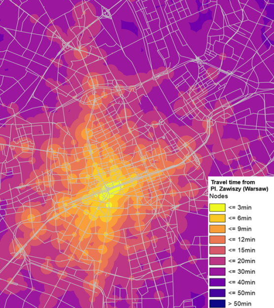
A good first diagnostic is simple: how long does it take to reach key destinations from a stop or node, at a given time of day?
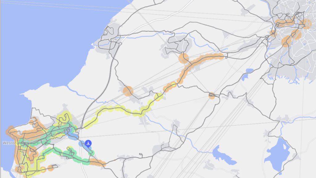
In PTV Visum, I often begin with isochrones to visualize reachability. When needed, I export them to GIS formats so I can overlay catchments with land use, demographics, or planned development areas.
What to look for:
- Gaps that contradict policy goals, for example access targets tied to “15-minute” ambitions
- Areas where small timetable or transfer changes cause big drops in reachability
Map the flows
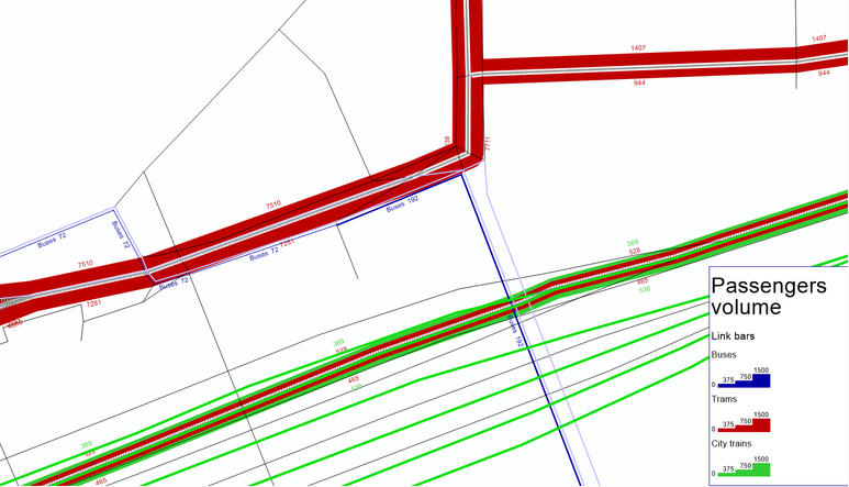
Once access is clear, the next question is: where are passengers actually travelling?
Passenger flow outputs help you see:
- The corridors passengers prefer, by system or mode
- The links that are overloaded, or close to capacity
This step is where assumptions get tested. What feels crowded on-site is not always the main bottleneck network-wide, and transfer corridors often matter more than people expect.
Check crowding
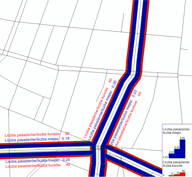
Flows become actionable when you convert them into capacity and utilization.
Using vehicle capacity and vehicle-to-trip assignments, you can derive:
- Passengers per trip
- Utilization of all places, or seated places only
- Vehicle-km, passenger-km, and seat-km indicators
The practical benefit is that you can move from “busy line” to “where and when capacity fails”.
Find the problem trips
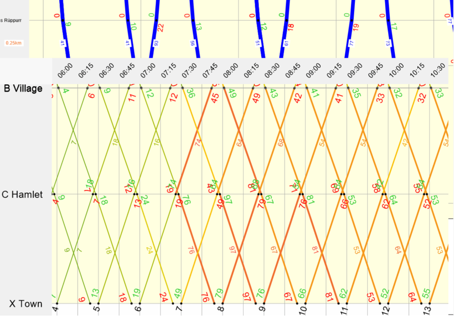
When you need to bridge planning results to operations, graphical timetables are one of the most useful views.
A graphical timetable that includes onboard load, plus boarding and alighting at stops, helps you pinpoint:
- Which exact trips are overloaded
- Which segments drive the crowding
- Where a targeted change beats a blanket frequency increase
This also makes it easier to communicate results to non-technical stakeholders.
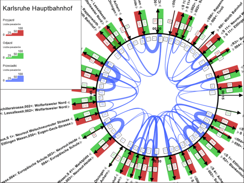
Fix the transfers
Many cities do not lose riders because vehicles are slow, but because transfers are painful and unpredictable.
Transfer views at key nodes help you understand:
- Which connections dominate demand
- Where waiting time is systematic (timetable pattern) versus random (reliability problem)
This is often the fastest win: synchronizing schedules at the right nodes can improve perceived service quality without major resource increases.
Make it operable
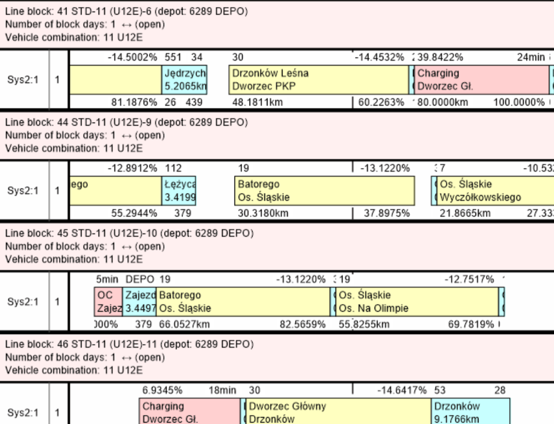
A strong service plan still has to work with fleet constraints, depots, and operator boundaries.
In the workflow, vehicle scheduling and circulation planning uses inputs such as:
- Vehicle properties like capacity and operating costs
- Vehicle assignment to trips
- Optional depot and operator constraints
- Optional charging infrastructure parameters for electric fleets
Typical outputs include:
- Required fleet size, also by depot or operator if needed
- Vehicle-km including deadheading
Make runtimes real
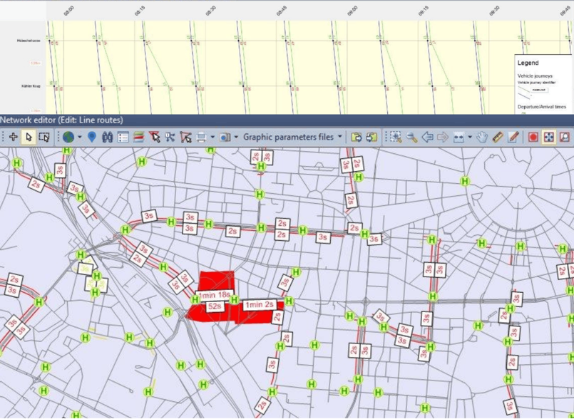
A timetable that looks good on paper but fails in the field will damage trust quickly.
Delay and runtime views help you identify:
- Which trips are consistently delayed
- Where delays originate
- Where runtime assumptions need to be adjusted
For many organizations, this becomes the bridge between planning and operations: it aligns the schedule with actual conditions.
Public transport planning workflow: Add money early
Cost discussions should not happen at the end. If they do, you end up redesigning under time pressure.
A practical cost view combines inputs such as:
- Vehicle-km costs
- Costs associated with stops and dwell
- Amortization assumptions
- Fare system logic
With outputs like:
- Ticket revenue estimates
- Costs to run lines, duties, or the network scenario
The key is transparency. If stakeholders cannot follow the cost logic, they will ignore the conclusion.

Ground it in observed data
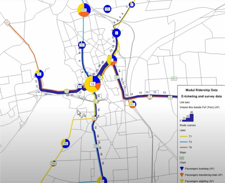
If you can connect model outputs to observed patterns, your results become more persuasive.
Ticketing data and surveys can support questions like:
- Which trips and corridors are most loaded
- Where passengers come from when boarding, alighting, or transferring at a specific stop
This step is also useful for spotting missing demand segments, for example suppressed demand caused by crowding or poor transfer quality.
Design options, then compare
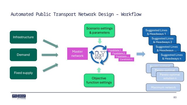
Once you shift from diagnosing problems to redesigning service, option management becomes the challenge.
A structured approach to route and frequency design should help you:
- Generate multiple feasible options
- Compare them consistently across objectives
- Keep the decision discussion focused on trade-offs
My practical rule: present three options, not ten. Coverage-focused, efficiency-focused, and a balanced middle.
Check emissions and side effects
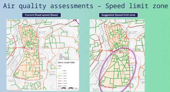
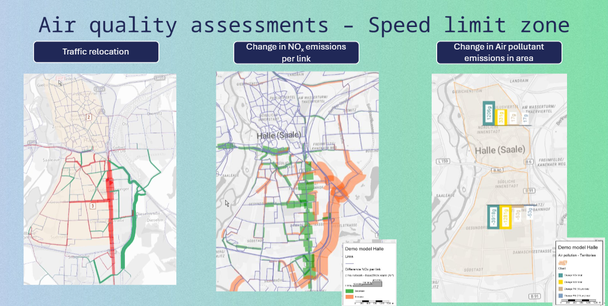
Environmental assessment is not only a reporting step. It is a way to detect unintended consequences early.
Emissions analysis can highlight cases where:
- A local policy looks beneficial in one zone
- But system-wide detours increase total emissions elsewhere
This is why you should include “side effects” in scenario reporting. It keeps the discussion honest and prevents one-metric decisions.
Stress-test the scenario
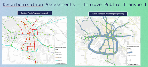
Scenario testing is where the workflow becomes decision support.
The goal is to quantify:
- Who benefits, and where
- What resources are required
- What trade-offs appear, including unintended impacts
For example, strengthening public transport supply can shift demand between modes, and the net outcome depends on network design, service levels, and constraints.
Scale the workflow
Two practical topics decide whether this approach scales beyond one analyst.
Automate outputs: Model-based outputs can be extracted and turned into repeatable deliverables, for example through Python-based workflows.
Share results with control: Project collaboration and access management matter when multiple teams and stakeholders need consistent results and dashboards.
A simple checklist
If you want to apply this workflow, keep it simple:
- Add fleet and cost checks early, then test scenarios and side effects.
- Start with accessibility for key nodes and time periods.
- Validate demand with passenger flows and observed data where possible.
- Translate demand into crowding and identify problem trips.
- Fix transfers, then validate runtimes and operability.

From data
to decisions
Learn about practical tools for planning and analyzing your public transport network
From data to decisions
Learn about practical tools for planning and analyzing your public transport network
Related Posts