
Table of contents
When a transit hub feels crowded, the real question is not whether capacity is insufficient, but which spot reaches the capacity first and why. In this article, I present a PTV Viswalk transit hub capacity simulation workflow that helps move from qualitative impressions to measurable evidence.
I show how to define capacity in two complementary ways that relate to day-to-day planning. First, where density builds up and remains high, signaling persistent bottlenecks. Second, how quickly platforms, halls, and exits recover after each demand pulse, showing whether the hub can cope with peak dynamics.
By the end of this article, you will understand how to build a baseline model, calibrate it with observed time data, identify bottlenecks you can defend with numbers, and test improvement measures before committing to operational changes or construction.
I use Beijing West Railway Station as the running example. It is a large rail transit hub with intersecting passenger streams, multi-level circulation, and high peak-period demand, typical for many major stations.
Note: This article is based on the academic paper Simulation and Optimization of Pedestrian Regular Evacuation in Comprehensive Rail Transit Hub – A Case Study in Beijing, by Qiaochu Chen, Nan Zheng and Yan Bai.
What capacity means in a transit hub
In practice, capacity cannot be represented by a single value. I work with two indicators, because each answers a different planning question.
Space-based capacity describes how density evolves and whether pedestrian movement becomes constrained. Density values are translated into Level of Service (LOS) to make spatial bottlenecks visible and comparable.
Time-based capacity describes how long it takes critical areas to clear or recover after train arrivals or sustained inflow. Recovery time is often more informative than peak density alone, especially in hubs with frequent demand pulses.
Together, these indicators reveal not just where congestion occurs, but how resilient the system will be during peak periods.
The workflow
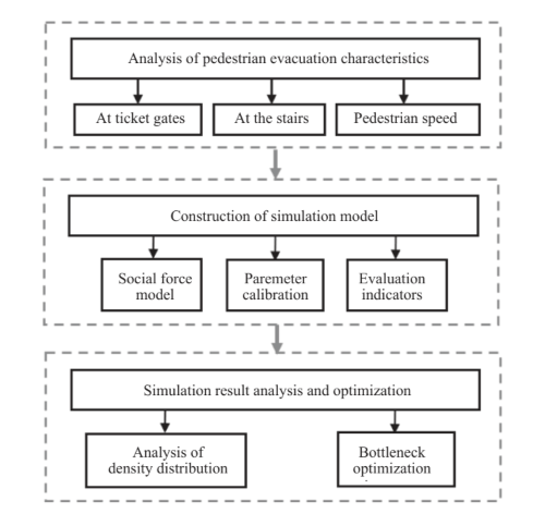
Use these four steps to turn field observations into a calibrated PTV Viswalk transit hub capacity simulation. Then, use the outputs to rank bottlenecks and test fixes:
- Collect field data for model parameter settings. Measure walking speeds by facility type, observe ticket-gate approach and recovery behavior, and record stairs-versus-escalator choice. Include luggage explicitly, because it affects both speed and facility choice and can change queue build-up and recovery.
- Model geometry honestly. Keep columns, pinch points, and mixing zones. In PTV Viswalk, represent walkable areas, obstacles, gates, stairs, escalators, and waiting zones as separate elements so conflicts emerge where they do in reality.
- Translate observations into PTV Viswalk settings. Use speed distributions (not single values) per facility, define gate zones to capture compression, and set a luggage share with reduced expected speed and increased space requirement. Encode stairs/escalator choice splits – values can vary for passenger groups with and without luggage..
- Verify before comparing scenarios. Check simulated travel or movement times against real data collected in the field. Only then run scenarios, change one lever at a time, and compare density/LOS and recovery time.
Using PTV Viswalk and PTV Vissim
In practice, the workflow was implemented as follows.
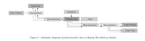
The station layout was represented using pedestrian areas, obstacles, and connectors in PTV Viswalk. Arrival demand was defined as time-dependent pedestrian input, reflecting observed peak inflow and train arrival sequences. For rail services, arrival pulses were modelled to reproduce the periodic loading of platforms.
Pedestrian attributes were assigned using speed distributions and behavior parameters derived from the field survey. Stairs, escalators, and gates were configured as decision points with probability-based choice behavior.
Density and LOS were evaluated using Viswalk’s standard outputs, while recovery time was extracted by tracking how long critical areas remained above predefined LOS thresholds after each arrival pulse.
Scenarios were created by copying the calibrated baseline and modifying only one element at a time, such as train headways, flow guidance elements, or facility capacity.
What the model revealed
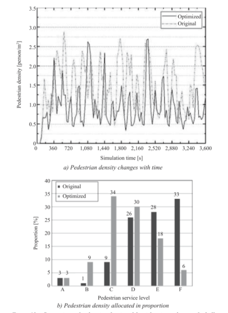
Platform bottlenecks are driven by pulses
On the platform level, density followed a clear rhythm tied to train arrivals. The highest and most persistent densities formed near stair connections and adjacent waiting areas.
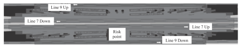
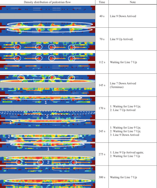
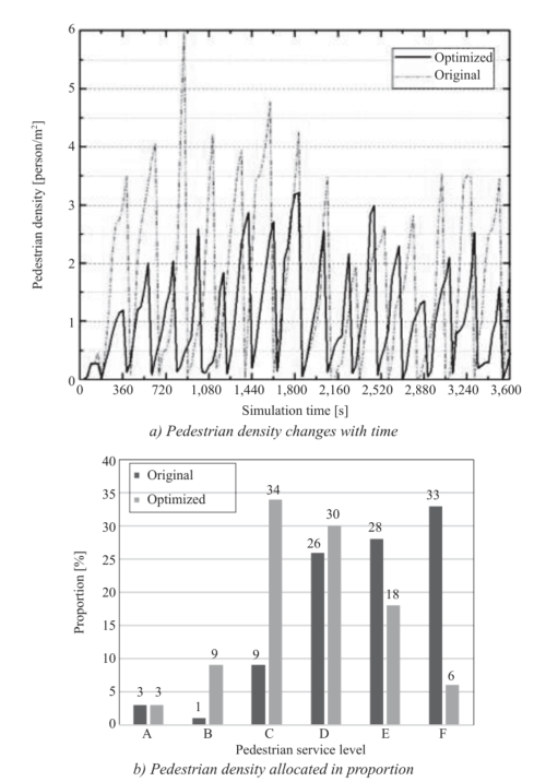
At the maximum risk point, peak densities approached 6 persons per square meter in the base case. More importantly, LOS remained poor for extended periods before recovering. This indicates a structural bottleneck driven by demand pulses and limited vertical circulation capacity, not a rare or accidental condition.
Improvement based on actual situation
In general, there are three ways to mitigate congestion at the risk point near the staircase:
1. Reduce passenger flow speed by changing their flowline (e.g., using diversion bars or buffer columns).
2. Reduce passenger flow volume (e.g., implementing temporary restrictions or adjusting train departure intervals).
3. Improve the facility capacity at the risk point area.
A field investigation of the study station showed that shortening the train departure interval was the most practical method. The images below show the changes resulting from shortening the departure intervals of Lines 9 and 7 by 14 and 30 seconds, respectively.
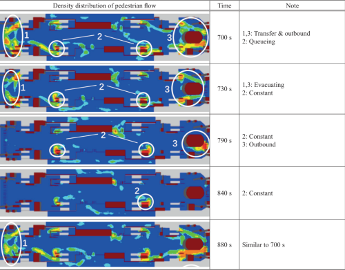
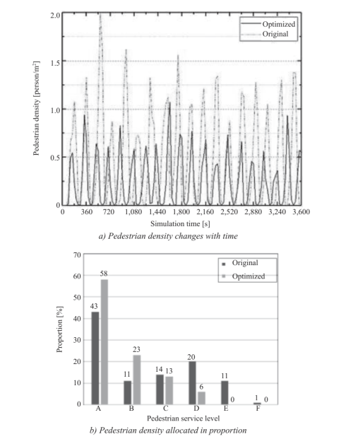
The transfer hall behaves differently
Although the transfer hall showed relatively lower peak densities overall, a few high-density spots formed for different reasons:
Risk point 3, located at the ticket gates, was caused by the limited number of gates and the spatial constraints of the dispatching room.
Risk point 1, located at the intersection of outbound and transfer flowlines, was caused by a large number of passengers.
Risk point 2, located at the staircase, was caused by an excessive number of inbound passengers.
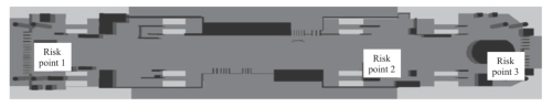
Here, pressure was more continuous and less pulse-driven, highlighting different capacity mechanisms that require different mitigation strategies.
Scenarios worth testing first
In transit hub projects, I group improvement measures into three categories.
Operational changes reduce arrival pressure when physical expansion is not possible. At Beijing West, shortening train departure interval lowered peak densities and shortened recovery times on the platform.
Flow management measures change how pedestrians approach and queue. Small channelization elements near stairs and escalators improved order and reduced density at transfer hall risk points at Beijing West. These measures are often low-cost and reversible.
Physical capacity and space constraints address hard layout limits. At the south exit, adding ticket gates alone had little effect because a nearby space constraint dominated. Only when the constraint was removed and the gate capacity increased together did density drop and recovery time improve significantly.
Checklist you can use
To replicate this approach in another transit hub, start with the minimum inputs needed for a credible model and focus outputs on bottlenecks and recovery performance.
- Inputs include time-varying demand by entry, walking speed distributions by facility type, choice behavior where alternatives exist, and realistic arrival pulses where applicable.
- Outputs should include density and LOS over time at hotspots, recovery time after demand pulses, and clear scenario-to-scenario comparisons.
Limitations
As with any pedestrian simulation, results depend on the behavioral assumptions used. If passenger mix, signage, or operations change, key parameters should be modified accordingly rather than reused blindly.
LOS thresholds are useful for comparison and communication, but they remain a simplified representation of comfort and constraint. They should be treated as a reference, not a decision-making measure of passenger experience.
Finally, some measures that perform well in simulation may be difficult to implement in practice due to operational, organizational, or funding constraints. Ultimately, simulation helps you visualize and measure improvement methods before stakeholders make definitive decisions.
Conclusion
What I value most about PTV Viswalk transit hub capacity simulation is that it turns subjective discussion into a practical experiment. It allows planners to identify bottleneck locations based on real data, understand why they occur, and test what changes when different operational, flow-management, or physical measures are applied.
For users of PTV Viswalk, whether standalone or combined with PTV Vissim, this workflow provides a clear path from visualization to decision-making support. It helps justify capacity and bottleneck mitigation measures with visualized, quantitative outputs before committing costly changes.

Traffic Simulation for transit hubs
Test multimodal scenarios and compare measures before implementation
Traffic Simulation for transit hubs
Test multimodal scenarios and compare measures before implementation
Related Posts


