Pedestrians, Fundamentals, Evaluations, Tipps and Tricks
With the previous blog posts on Scenario Management: one of the key features for traffic simulation, and Scenario Manager in Vissim and Viswalk – Part II.1, Part II.2, and Part II.3 you know most everything you need to know to successfully create a Scenario Management Project in PTV Vissim and Viswalk. Now it is time to learn how to benefit from Scenario Management for result management and results comparison between scenarios. To do so, we return to the first example project of the bottleneck with various modifications.
Evaluations and Scenario Management
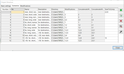
Evaluations are done and managed separately for each scenario. Result data can be browsed in lists, and they can be visualized in charts and scatter diagrams.
By default, only a scenario’s own result data is available when a scenario is loaded. Additionally, result data from other scenarios can be made available in each scenario of a project with settings as shown in the figure on the left.
This allows to show data from different scenarios side by side in lists and it allows to show data from different scenarios together in a single chart.
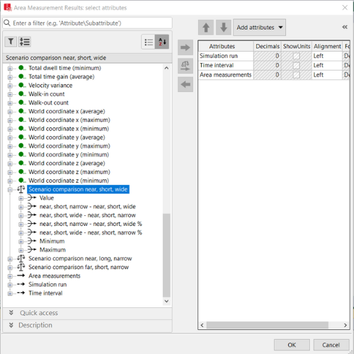
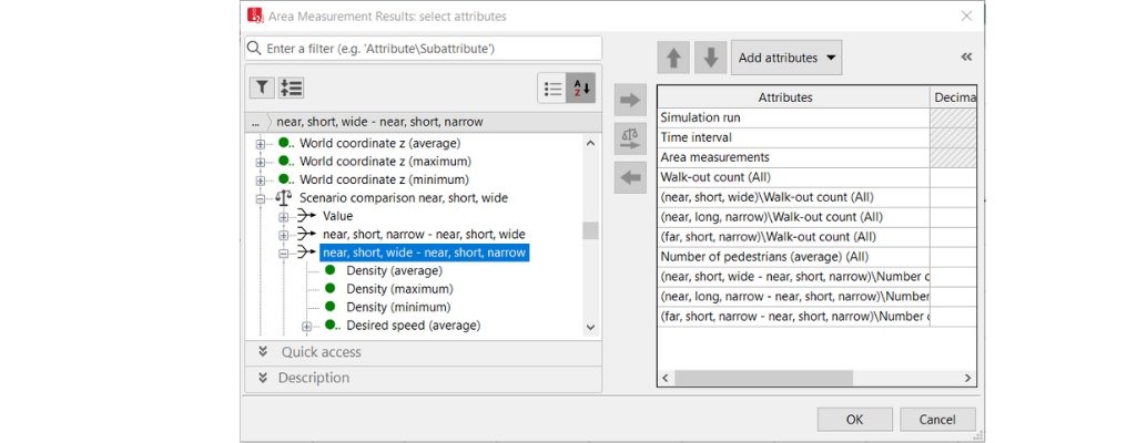
To do so, first, scroll down in the attribute selection dialog where you can find the data from the other scenarios. In addition to the value also difference values between scenarios can be selected, see figure on the right. If you want to show the same value from all scenarios which are available, the balance icon offers a short cut to add all at once to the right side of the dialog.
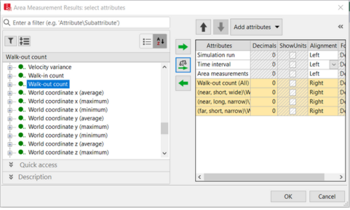
Here is a small trick how from the list shown one can quickly produce a chart: assume we want to show for all scenarios the evolution of the average values of scenarios over time. Then scroll down until the simulation run averages are shown in the list, mark for one line the scenarios and right click to call the context menu as shown in the next figure.
Doing so results in having a column for each Scenario in the Results lists, see Figure 30.
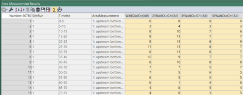

With some layout clean-up the result looks as shown in the next figure.
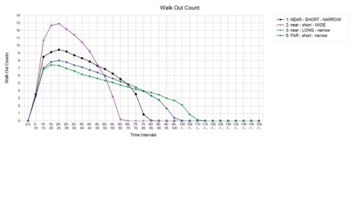
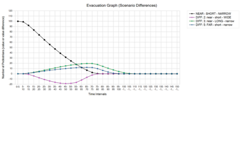
As an example, for a display of differences between results of different scenarios the figure above shows the evolution of the number of people in the room over time as difference plots. This plot visualizes the data from the third entry of scenario comparison, as shown in the following figure.
Grid Evaluations
Viswalk offers the possibility to evaluate simulations on the base of a grid. The resulting data can be displayed directly in the Network Editor. The grid resolution (cell size or node distance) can be configured. Properties that can be evaluated include density, experienced density, speed, velocity variance, and required safe egress time (RSET). The latter is simply the simulation time at which for the last time a grid cell is covered by a pedestrian (for safe emergency egress it is required to keep that spot safe / free of smoke at least until RSET). The figure on the left shows this with scenarios 1 and 5 as an example..
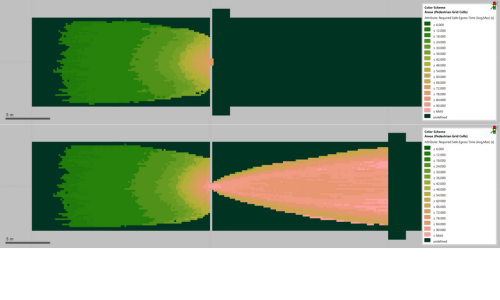
Like all other kinds of evaluations grid evaluations allow scenario comparison. That means that cell by cell the difference between two scenarios is calculated and the result is shown color-coded at the position of the grid cell. The following figure shows this for the two results shown in the last one.

Quite obviously in the last figure, the space behind the bottleneck must be colored red, since only in the “far” scenario pedestrians have been walking there, and hence a RSET>0 results, yielding large difference values when comparing with the “near” scenario. At second glimpse the red area upstream falls into the eye. In total it nicely visualizes how the “edge” of the simulation – which in this case refers to where pedestrians are taken from the simulation – has an upstream, inbound effect on the simulation. Even though pedestrians are walking almost freely once they have passed the bottleneck in the “far” scenario, they still influence pedestrians following behind, finally yielding a clearly different result than the “near” scenario. The result as such is already shown in the evacuation graph however the grid display of RSET also propagates an intuitive explanation as it appears reasonable that the red tones gradually fade from the bottleneck upstream instead of showing a hard cut.
Since pedestrians walking away from the bottleneck in scenario 5 is the clearly more realistic modelling than pedestrians dissolving into thin air at the bottleneck in scenario 1, we can expect that the results of scenario 5 with respect to flow, delay times, speeds, and density are more realistic than those of scenario 1 and we recover the long-standing advise: in simulations evaluations should be done only in good distance to the edges of the simulation model. Otherwise unrealistic artifacts might make it into the results.
As a final remark: comparison of grid results is only possible when the grids of the two scenarios which are involved in the comparison are identical. That means in first place that if the grid spacings are different no difference can be computed. However, even if the grid spacings are identical also a translation of the grid spoils the possibility to do a comparison. The offspring of the grid is computed automatically by Viswalk and it depends on the bounding box of the model. Therefore, grid result comparisons can only be made between scenarios which have an identical bounding box for their walking areas.
You can find this Scenario Management project for download here.
