Improving mobility and transportation starts with good ideas, and often continues with modelling and simulating, to test different scenarios. But the success of your mobility project also depends on how you present it to stakeholders – from colleagues and external experts, through local authorities, and finally the public. Enter PTV Hub – a new digital tool helping mobility planners present projects and their effects. PTV Hub now becomes available to users worldwide.
PTV Hub, in short, enables planners to tell their mobility story with attractive visualizations. It provides personalized cloud-based dashboards, including interactive maps, based on data from PTV Visum, the widely used multimodal transport planning software.
PTV Hub makes it easy to collaborate with others, by sharing dashboards with beautiful and self-explanatory maps, animations, and charts. In addition, it has many useful features, an intuitive workflow, and integrated interactions for dashboard viewers and guests that will make your mobility project more attractive.
Whether you’re already using PTV Hub, or considering doing so, here are some of its coolest features that will help you succeed in your next mobility projects:
1. Team management: Create a team project space
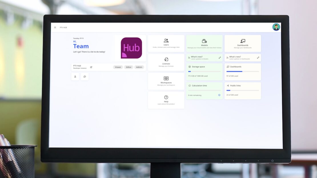
When starting your transport model, PTV Hub is a safe place for your team and stakeholders to collaborate and share data and results. Manage access and decide who are the editing “content creators” and who are the commenting “content reviewers”. Develop a collection of dashboards with maps and charts to show every aspect of your transport model.
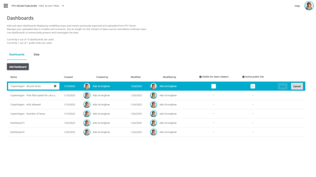
How to do this: In the User Management, invite your team by entering the relevant e-mail addresses and sending out invitations. Decide which accounts see what, by assigning roles in the user management and by making dashboards visible (“visible for viewers” = yes/no).
Watch how it’s done in this video:
2. Commenting in PTV Hub: Easily document your next network review
In a few clicks, you can create review maps displaying the important characteristics of your transport network. Review details like link speeds, one-way-roads directions, assigned capacity, and much more. Invite a review team consisting of agencies, consultants, and stakeholders. Collaborate and comment directly on the map and document your review process with replies and resolutions. Additionally, collect feedback to increase your stakeholders’ engagement and projects acceptance and quality.
How to do this: Upload data comfortably from PTV Visum, add a dashboard with a static map, create respective layers, and invite others to comment.
Watch how it’s done in this video:
3. Share your findings with stakeholders and the public
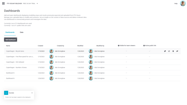
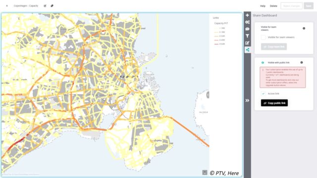
Start collaborating on dashboards by simply copying a dashboard’s team and/or public sharing link. Digitally deliver your interactive project findings with a large circle of stakeholders. Promote your past portfolio in your next project pursuit. And organically grow your business or outreach topic via social media integration that preview your stunning visuals on your favorite social channels.
How to do this: Simply copy the link to a dashboard.
4. Interactive maps and charts: Quickly create collaborative content
After uploading your data, you can present it in PTV Hub with interactive maps. Customize maps to your project’s needs. Suggested maps based on your data quickly get your dashboards started. Maps come with an automatically generated tooltip and the option to combine all needed data using layers.
How to do this: Select template, customize layers, and then just click on objects in the map.
Watch how it’s done in this video:
5. Cloud-based public transport animations: Bring timetables to life
Animations help everyone understand the timetables of buses, trams, and trains. With them, you can confirm the geographic- and time-related aspects of current, planned, and anticipated timetables. PTV Hub’s interactive playback of public transit trajectories visualizes your vehicle headways and plan coverage.
How to do this: Search for your timetable data in the suggestions from your data field, then add your animation.
Watch how it’s done in this video:
6. Isochrone maps: Showcasing multimodal accessibility
Accessibility is a critical topic in transportation planning for stakeholders, business owners, and the public. Communicate your plans connectivity and gain plan acceptance with PTV Hub.
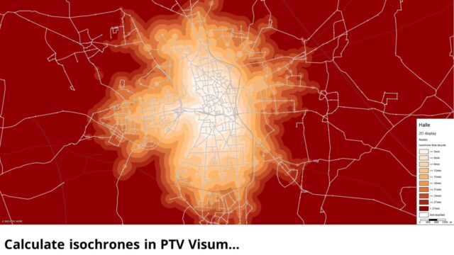
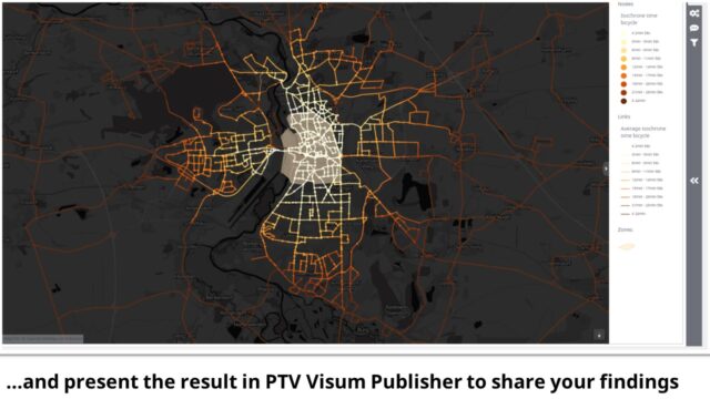
First, calculate isochrones in PTV Visum. This enables you to show how accessible you are to travel by modes from a starting point within a certain timeframe. Then, in PTV Hub, displaying these maps with details, such as travel times, helps your audience understand the reach of the selected transport system for its targeted user groups.
How to do this: Calculate your isochrone on Visum side, save the result as user defined attribute for links, export data for links and nodes and show it in a map.
The example below, created with PTV Hub, shows the reach of bicycle infrastructure traveling to the inner-city using bicycle travel times and a color gradient scale.
7. Create content for target audiences with PTV Hub
PTV Visum Hub establishes targeted visuals across a wide breadth of topics to connect with many audiences.
You can communicate directly with line, urban, and infrastructure planning experts or the public. Quickly copy and tailor your story’s message, while using the same data sources. Be assured that if your model data needs an update, your dashboards and KPIs will automatically reflect the changes.
Assignment results, such as network flows and flow bundles, are important KPIs for many disciplines. Cross-discipline reviews of interactive Hub dashboards bring valuable insights to your transport model and increase study adoption.
How to do this: Reuse dashboards by duplicating them and adjusting them to your needs.
Watch how it’s done in this video:
8. ABM visualization: Animate unique activities and trips
Animations play a big role when you need to demonstrate your mobility project to stakeholders. That’s why PTV Hub enables you to animate activity executions and ABM trips for selected locations and trips.
How to do this: Use the new ABM export function to export a selected set of activity executions and trips. When using a speaking name, you can quickly look for your data in the “Suggestions from your data” and add an animation to your dashboard in no time.
Watch how it’s done in this video:

